From pandemics to fish food: Can we keep our heads above the data deluge?
by Emily Conklin
Last year confronted us with huge amounts of data. In March 2020, I watched, with a pit in my stomach, as COVID-19 case counts continued to climb day after day. Nearly overnight, terms like “exponential growth” and “positivity rate” became topics of household conversation, and lots of attention turned to COVID-19 dashboards and graphs. For me, it became an unpleasant ritual to check the local case counts every morning. How many members of my community were getting sick? How well were the hospitals coping?
Now, after the fall Delta case spike here in Hawaiʻi, there are even more numbers to track, including vaccination rates and travel numbers. As of December 2021, at more than 275 million confirmed cases worldwide, it’s a mind-numbing amount of information to wrap my head around. And yet there’s a huge effort to help people do exactly that; COVID-19 data is constantly being broken down, presented, and visualized in different ways. This can help health experts identify communities that are especially at-risk, and help non-experts (like me!) understand when, where, and how the pandemic is progressing.
It’s been a huge test for communicating science effectively, and a big part of that test is the sheer amount of information. For COVID-19 case data, picture a spreadsheet 200 million rows long. Scrolling through that spreadsheet and trying to make sense of it isn’t realistic, and turning that into something readable and useful to other people is a challenging task!
Outside of public health, many other fields are also dealing with overwhelming amounts of data. For example, in biology, it’s become much easier and cheaper to study DNA. Putting together the first human genome took 13 years and almost $3 billion back in 1990. Now, we can do the same thing in a matter of months and for just a few thousand dollars. The outcome is almost more genetic data than we can keep up with, but also presents cutting-edge ways to answer old questions.
One of these questions in marine biology is a deceptively simple one: what do baby fish eat? Many of Hawaiʻi’s most important fish species have very complex life cycles. Young fish can spend days to months in the open ocean, riding currents, before eventually finding their way to an appropriate habitat. These youngsters start off tiny – some the size of your pinky fingernail – and often look completely different than the adults. Fingernail-sized babies scattered across a wide ocean can be pretty hard to study, so in general, we know very little about these early life stages, including what they eat. For lots of marine species, we have no idea about what they are snacking on out there. Understanding the diet of these baby fish can help us learn more about their ecology, as well as potentially help aquaculture efforts.
For adult fish, we can use the more traditional (although usually stinky) method of dissecting the fish and visually identifying the contents of the digestive system. Since this isn’t really an option for the tiny babies and their even tinier food items, my Hawaiʻi Sea Grant Graduate Fellow project involves trying something new: sequencing all the DNA information in the whole fish, including anything it might have recently eaten in the wild, and matching up the detected DNA sequences to possible food species. This method allows us to study the diets of many fish at once.
However, as already discussed, the more data we have, the more difficult it becomes to communicate it well. With data sets that include many different species of fish, each of which might be eating many different foods, things get complicated quickly.
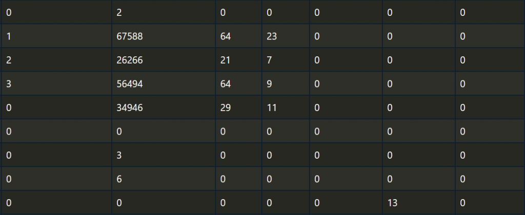
Believe it or not, these rows and columns hold all the information we are interested in. It can tell us what baby fish are eating, whether different species have different diets, or if they all eat the same foods. It can also tell us how picky these baby fish might be. Do they eat essentially anything that will fit in their mouths? Do they rely on a single type of food? Or does the truth lie somewhere in between? But to answer these questions, first I need to translate this maze of numbers into something more easily interpreted by people, rather than computers. The raw data needs to be “baked” into something more digestible.
After experimenting with a variety of ways to visualize this data, we decided to use a “bipartite plot” (i.e., a graph with two parts), or to use its more poetic name, an “alluvial plot.” This name comes from the alluvium silt deposited by a running stream, and it’s easy to see why: the flowing connections between different data points do look like a colorful waterfall.
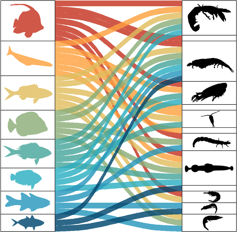
The left side of this waterfall, includes the species of baby fish included in our trial run. The right side includes the food species we identified using DNA. The colorful connections show which baby fish were eating which foods. While this is very preliminary data and doesn’t give us the whole picture yet, the plot illustrates right away that a few food species are very popular and are munched on by many kinds of baby fish. Others were only eaten by a few kinds of fish (perhaps they are not as tasty?). We can also see that some baby fish eat many different foods, while others seem pickier.
From COVID-19 to baby fish, the usefulness of data ultimately depends on what we do with it. We can generate data more quickly now than ever before, but for it to be helpful to our communities, we need to pay equal attention to how we present and communicate that data. While it’s sometimes hard to keep my head above the water of today’s information flood, I’m enjoying learning new methods and tools for being a better communicator.
 About the author:
Born and raised in New York, Emily is now a PhD student in the ToBo Lab at the Hawaiʻi Institute of Marine Biology at Moku o Loʻe in Kāneʻohe Bay.